The Retail Report is a recurring look at different physical retail shops. Here, we examine the merchandising, branding, marketing, and storytelling through branded environments.
Wandering in to Kai D. Williamsburg, Brooklyn
Kai D.’s store in Williamsburg, Brooklyn is what a flagship should be. In fact, it’s more. As mentioned in Retail Report: A Look at the Club Monaco Flagship Store in New York, the intention of a flagship is to provide a shopping environment that is the most impressive physical representation of who the brand is and what they have to offer. Kai D. elevates this concept.
Boutiques, and multi-location retailers, even online retailers and fashion brands, can learn a lot by visiting and taking note of the brand and its dedication to its philosophy, its use of space, curation of products, and consistency in every consumer touch-point.
Kai D: The History
It’s important to understand the brand’s history, values, and products, because as mentioned, the flagship is meant to capture these elements. So let’s look at this briefly:
What is Kai D.?
Eponymously named for the founder, Kai D is a brand that provides “tools and clothing for artisans.”
Who is their target audience?
From the site: “Kai D aspires to outfit the New American Artisan.” Their definition of an artisan is “a worker who practices a trade or craft; or one that produces something in limited quantities using traditional methods” and they finish that description by saying “That is who we are.”
It’s a brand for artisans, by artisans.
Values
From reading various descriptions on the site, we can ascertain that values include, but are not limited to:
- Handmade craftsmanship
- Sustainable and ethical manufacturing (Items are produced locally in NYC)
- Quality/Durability
- Sense and respect for History
Aesthetics
Timelessness is the guiding design principle. “Wearable now. Wearable ten years from now.” is how the designer approaches the clothing. This informs choices in using natural fabrics, such as wool, cashmere, and cotton from historic mills, and providing meticulous finishing with locally made buttons and trims derived from natural sources like the Corozo nut.
Kai D.: Retail Wonderland
Kai D.’s retail space is built on and reflects the brand philosophy, products, values, brand and product aesthetics, and of course – the audience. In this article, we’re going to walk through the experience of the visit, and then break down specific points about the retail space.
Visiting – First Glance
First of all, we want to point out that even the way you discover the store seems on-brand. It’s not flashy, but it is inviting. It’s a little off to the side of the trendiest streets in Williamsburg, and you feel as though you stumble upon it.
Once inside, you get a sense of the philosophy right away. It feels all at once vintage, on-trend (present), and timeless. Which is a little confusing – but that’s the way they want it:
“We design clothing that nods to history, embraces the present, and endures the future…We own and embed ourselves in a studio and store brimmed with vintage clothing, ephemera, and furniture. These objects are historical, purposeful, and endlessly inspiring…We are, in short, vintage-to-be.”

Visual Interest and Impactful Displays
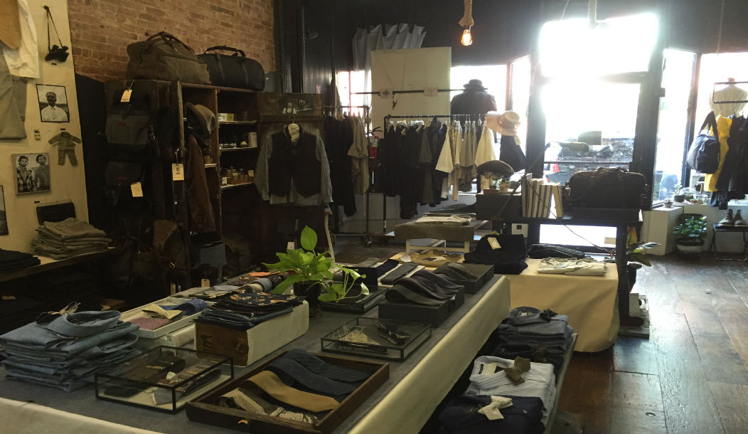
Unusual displays, creatively used spaces, choice of furniture, and the grouping of objects delivered maximum impact in a small space. No matter the angle, your eye is drawn towards something interesting.
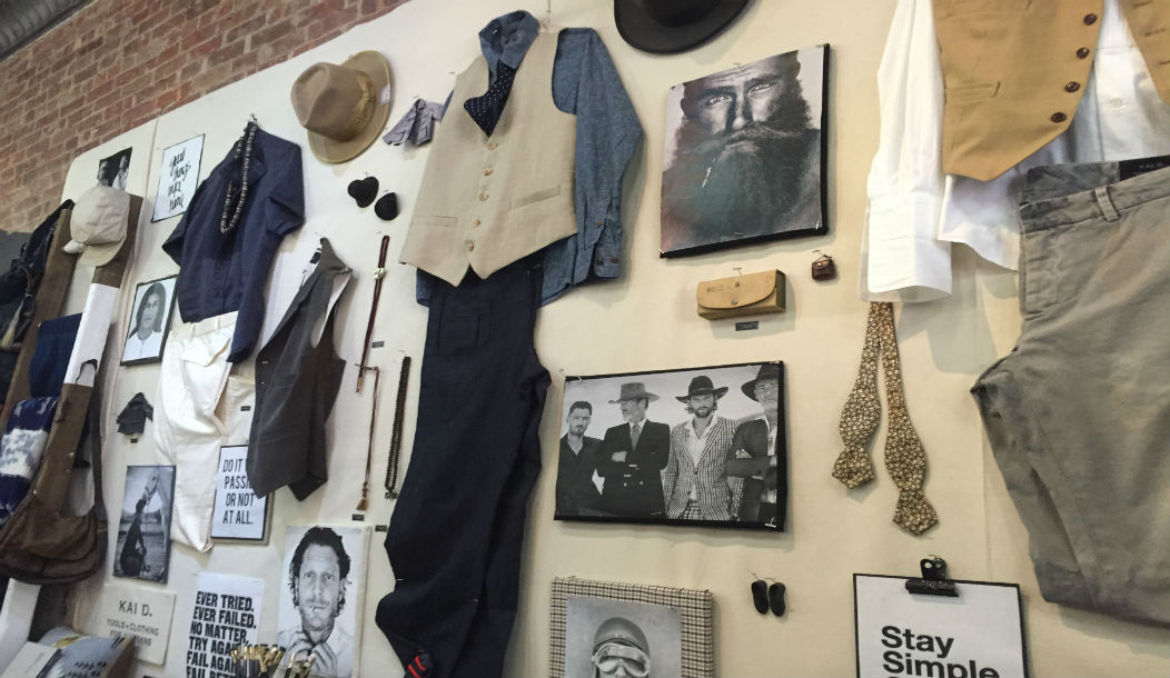
Take for example the wall shown below. It’s one of the first things you notice when walking into the store because of its scale and height (nearly goes to the ceiling). It’s brilliant: The mix of products, photos, and outfits provides visual interest, suggests to the customer how to pull items from the store together, suggests the culture of the company, and displays other interesting items.
You understand the entire brand, all at once, by looking at the wall.

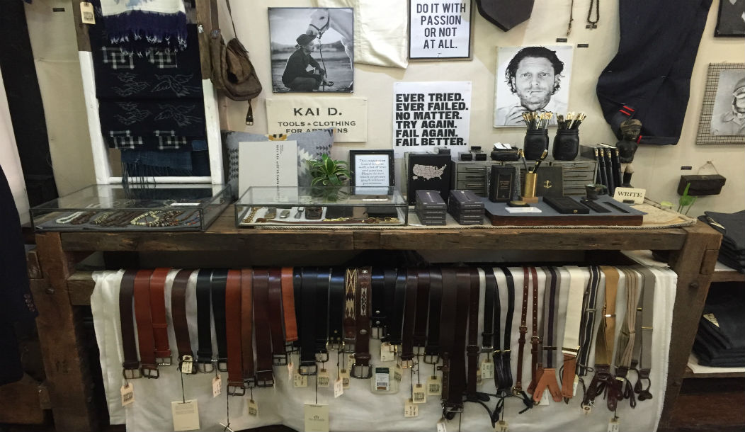
Notice in the second picture how belts are displayed – it’s a an example of a creatively used space and displays what is normally a difficult product.
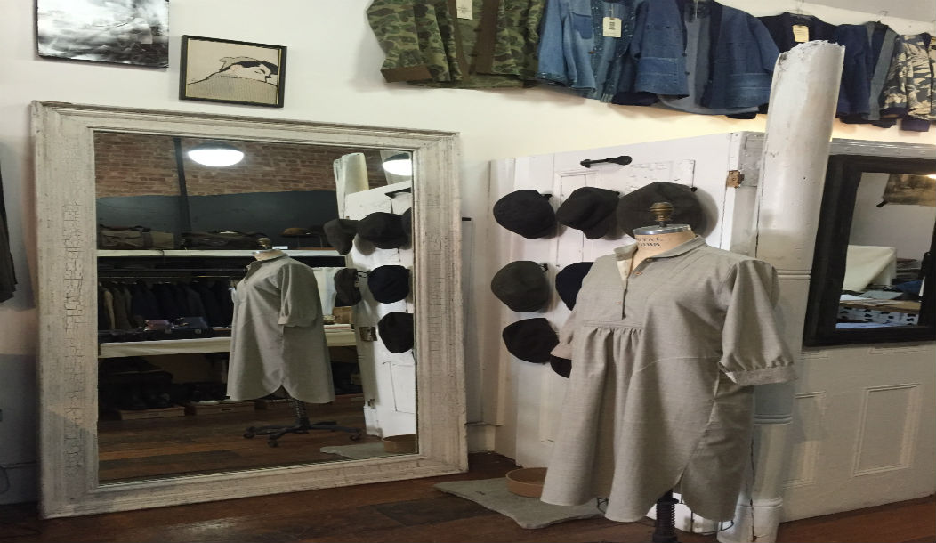
In the third picture below, notice the wall lined with jackets. They are both prop and product here – which is extremely effective from a merchandising point of view.
Curation
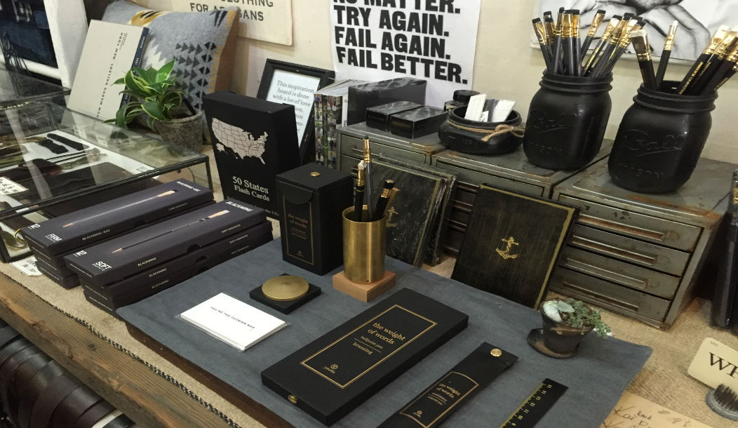
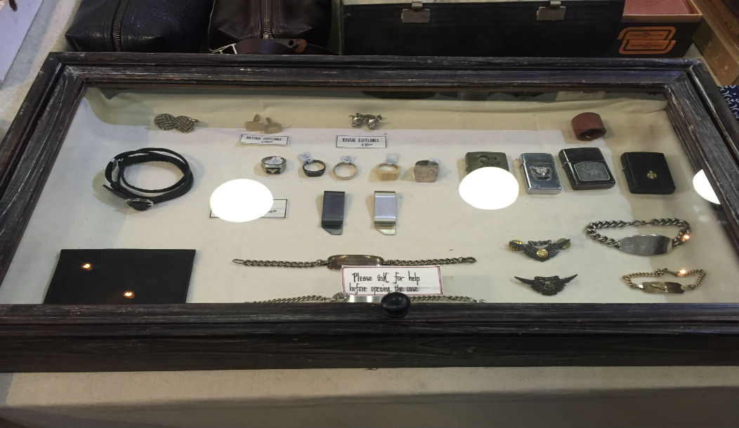
The mixture of items – artistic, hand-crafted, practical, vintage or modern, are all on-brand. These products reflect the interests of their target customers, the artisans. Inclusion in the store is suggestive of a particular lifestyle. Pencils and pens, books, letterpress cards, knives, and other accessories are items that artisans use and appreciate.
Kai D.: Where ‘detail oriented’ is an understatement.
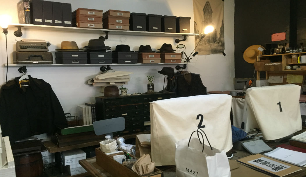
Like many flagships, here, we see that details are important. Not one detail was overlooked in providing consistency with the brand. Notice how they even cover computers to match the aesthetics of the store and products.
Summary of a great retail space
Normally, we say that an analysis isn’t over until we address both the positive and areas of improvement. We’re stuck on this one! The only thing that comes to mind is that the store may be overwhelming. A customer may step in and not know where to start. However, the current set-up totally works because the store looks like a vintage or antique shop – where browsing and weaving around is encouraged.
We’re just making a note of it because in some cases, it’s beneficial to draw the customer to something specific when they first come through the door. A display of the season’s top products is an example.
Takeaways
This space is interesting, inviting, and stayed true to every aspect of the brand’s personality and values. In summary – Kai D is a lesson in great retail design. Everything from the lighting, to use of scale, height, level, variety, and props makes this unique place worth the trip.
Key takeaways to think about as you explore your own retail startup or pop up space:
- Use space wisely – not only to display products but think about ways you can tell your brand’s story visually.
- Find unique ways to display things and pay attention to how items are grouped together. Think of the contrast of arranging similar items together, or bringing different objects into one display.
- Curate products to indicate your brand’s lifestyle. Be mindful of what you choose. Are they on-brand and would your audience be receptive to it?
