
The Retail Report is a recurring look at different physical retail shops. Here, we examine the merchandising, branding, marketing and storytelling through branded environments.
Retail Concept: The Flagship
“The Crown Jewel” of a retail chain’s business – the flagship store – is created to be an important piece of not only a company’s retail strategy, but the long-term brand strategy. It is the most impressive physical representation of who the brand is and what they have to offer.
In order to provide contrast against our last analysis on AWAY’s charming pop up shop, we visited the Club Monaco Flagship store on 5th avenue in NYC.
There are huge differences in strategy, scale, and history (among other things) between these two retailers. However, there are also key overlapping principles. For example, the emphasis on telling the brand story, creating a lifestyle, building eye-catching displays and curating products.
It’s important to examine the best practices of all retailers – big and small – to collect insights used to inform your own initiatives. You can get ideas for a pop up shop, retail space, or even a booth at an event space.
The Club Monaco Flagship
We chose Club Monaco because it is an excellent example of a flagship store, perhaps the best in the city. If you are going to observe pointers on great retail experiences, here would be the place to do it.
In their own words: Club Monaco is an international retail brand that designs and creates modern yet timeless clothing and accessories for women and men.
This juxtaposition of “modern yet timeless” is completely consistent through every step of the customer journey. This idea influences everything from the window design, to the dressing room, to the checkout experience. It’s reflected in brand partnerships and the curation of products. It guides choices in displays and décor, including materials, lighting, props, and use of color.
A Lifestyle Destination: Partnerships & Curated Products
Partnerships
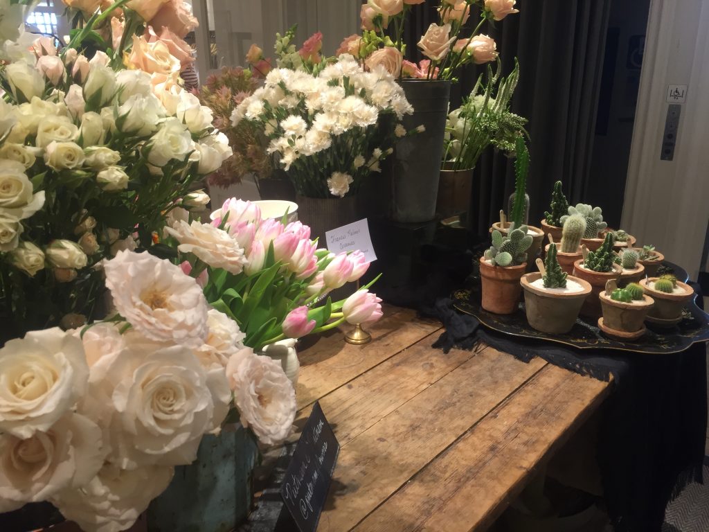
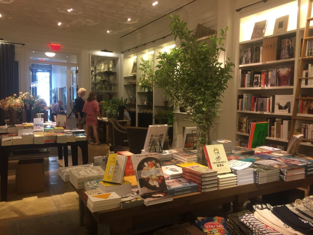
The Club Monaco brand comes alive in this sophisticated space, which is comprised of several distinct areas; a main shopping area (men & women), an outpost of Toby’s Estate coffee, a flower shop, and a sort of annex to the iconic NYC Strand bookstore. This “cross-retail experience” was inspired by Club Monaco’s blog, Culture Club, which “seeks to reveal connections between food, music, art, travel, fashion, photography and the clothes they inspire.” These partnerships represent the various components of the Club Monaco lifestyle.


Curated Products
Again, to emphasize the “modern yet timeless” connection, the store mixes old and new products together on the retail floor. For example, while looking for this season’s “it” jumper, you may come across jewelry from an under-the-radar brand, and can peruse a collection of vintage Chanel handbags and watches.
All clothing and products are displayed in an intriguing manner. Clothes aren’t merely on racks – they are draped over furniture, displayed on one of the many mannequins, or found in beautiful pieces of vintage furniture.
The store does a particularly good job of scattering it’s accessories around the store in attention-grabbing mini displays. This is no mistake – the flagship launched around the same time as the clothing retailer enhanced its accessories, bag, and shoe offerings. These displays serve as hints and reminders (maybe to complete an outfit?) and are integrated seamlessly into the experience.
Props and Furniture
The props and furniture enhance the setting and create visual interest. At every turn, it’s possible to find something interesting. Props, furniture, art, and other display elements round out the in-store experience. These complement the different feelings or moods you may come across at different points in the store. Again,there is a mix of new and old in the furniture and art. Thoughtfully designed props add yet another point of visual interest, adding color and texture to displays, and in some cases, draw the eye towards specific merchandise.
In one more example, certain light fixtures not only play into the interior design, but provide concentrated light in areas that are asking to be noticed. They are used to draw your attention to items on display.
Areas for Improvement
The Club Monaco flagship shopping experience is meticulously crafted, but there are a few areas that could use some improvement.
First of all, there is a huge contrast between the Men’s and Women’s sections. The distinction makes for an interesting shop. However – and this is just a personal thing – we wish the women’s area had a little more personality and depth. The men’s area could be described as a memorable men’s club with every display and item looking like it holds a good story. Meanwhile, the women’s area relies on stereotypical feminine design elements and while pretty, is slightly generic. There isn’t anything unexpected breaking up the space.
Secondly, perhaps Club Monaco is missing an opportunity to integrate the Strand, Toby’s, and the flower shop in the actual shopping area. For example, scattering the books around may add interesting visuals, and would serve as reminders for people to wander into the bookstore.
Lastly, the cases filled with vintage items could hold a little more explanation. Customers want to be educated about the products they purchase, and maybe even be told a story about the history of the item. This might make the products seem more special.
Summary: On-point and On-brand
These days, it’s tough to pull people offline. But if you offer them something special and unique they are more likely to visit. Club Monaco has found a way to do that. They offer a way for current and potential customers to interact with the brand that cannot be done through any other channel. Despite being a major commercial brand, Club Monaco has done a great job of balancing an expected experience (you know what you are going to get – and that’s partially the reason you visit) with a surprising one. Their partnership choices, mix of old and new, and thoughtfully designed interiors and displays promote one, cohesive vision that amounts to an impressive statement.
What can we, as fashion startups take away from a visit to an international commercial success? Follow their lead in great retailing and merchandising. Namely:
Great Retail: Main Takeaways
- Consistency is key – Emphasize your brand values and distinct personality over and over. Example: Club Monaco blends modern and timeless characteristics together. They emphasize this in every consumer touch-point.
- Set yourself apart from competitors and offer shoppers a reason to get offline and go to your store. Example: Club Monaco uses partnerships with Toby’s coffee and the Strand to bring a variety of customers to the space.
- On the note above – explore partnerships!
- Enhance your brand’s lifestyle and story through interesting displays and props.
