
When was the last time you took a good look at your logo and made sure it was working for you? And I mean working as in “doing work.” Your logo isn’t just there to look pretty; it needs to attract the right customers and establish trust.
As a fashion business, this is even more important. Your customers are coming to you with aesthetic top of mind. They are deciding whether or not your aesthetic is the one they will put on their bodies to reflect themselves to the world. They see your logo at the top of your website and quickly judge whether or not your brand reflects them – even before they have scrolled down to see your products.
But how can you even tell if your logo is doing a good job?
What makes a logo good?
Whether you’re designing for a roadside diner or an upscale boutique, there are consistent principles for good logos. A good logo is…
Simple: Often when non-designers are making logos, their impulse is to over-design. Don’t fall into this trap! Nike’s logo is a simple swoosh. Club Monaco is just text. Heck, so is Anthropologie, Topshop, The Gap, and many more.
Memorable: A customer sees the label in one of your garments, continues wandering through the boutique, and picks up another piece of yours. Will they connect it to the first one they saw?
Timeless: It’s hard to avoid trends entirely – that’s what makes something look current! – but the trendier your logo is now, the faster it will look outdated. (e.g. the Lobster font recently experienced a heyday, and you’ve probably seen a lot of geometric animals around)
Versatile: Your logo needs to work in a variety of settings, from the side of pens to a black and white ad in your local paper to the sew-in tag on the back of your garments. And it needs to be just as effective in each of these settings.
Appropriate: Above all, your logo has to be appropriate to the audience you are trying to attract. Just like bright purple might not be appropriate for an outdoorsy brand, elaborate script fonts may not attract people to your minimalist clothing line.
How to assess your own logo
It is always hard to self-assess, especially outside of your area of expertise. Here are some questions to ask yourself to tell if your logo is working.
Is it simple?
- Does your logo use no more than two colors?
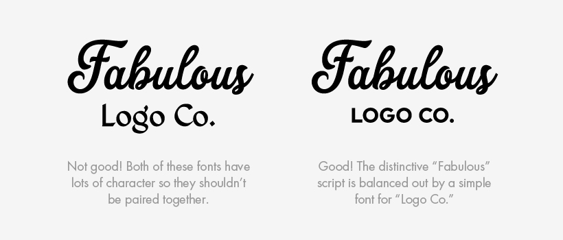
- Does your logo use no more than two fonts?
- If your logo uses two fonts, is one of them extremely simple?

Is it memorable?
- Would your customers be able to draw your logo after glancing at it?
- Can you describe your logo in just a few words? (e.g. interlocking Gs, a crocodile)
Is it timeless?
- Was your logo designed with a web presence in mind?
- Does your logo steer clear of dated design elements like gradients (colors that fade into each other), drop-shadows, and embossing?
Is it versatile?
- Is your logo not just legible but effective when written on the side of a pen?
- Does your logo work in black and white?
Is it appropriate?
- Does your logo use a brand-specific icon? (as opposed to generic icons like: swoosh, person-as-tree, a dress, etc. Consider: if a competitor used your icon would it work just as well for them as it does for you?)
- Did you purchase the font(s) used in your logo? (Instead of using a free font or one that came standard on your computer.)
- Choose five adjectives (like these) to describe your products as a whole (e.g. natural, modern). Then set that list aside and make another list of five adjectives describing your logo. How well do these lists match?
If you’ve answered “no” to one of these, don’t stress. If you’ve answered “no” to more than that, it might be time for a change.
Want more help? Download a free Logo Assessment Checklist!
How to make your DIY logo look professional
Here’s the thing: if your logo looks amateurish, so will your business. Your customers don’t have to be graphic designers to understand if you took your logo seriously. Do you remember the hubbub when AirBnb launched their new logo? Or the 30 seconds in 2010 that The Gap had a different logo, until they were shamed into bringing back the old one? Consumers care about logos.
First and foremost and forever: keep it simple! If you want an elaborate logo, hire a pro. Otherwise, stick to text. If you think that’s boring, take a moment to scroll through the homepage of myfonts.com and check out the great variety of typefaces. Then consider how very many big fabulous brands have text-only logos.
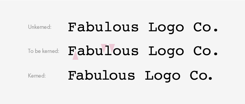
Correct the kerning. Sometimes when you just type out a word, the space between letters isn’t consistent. This is most obvious in typewriter-style fonts, but is also prevalent in free/cheap fonts and is even something to watch out for when using perfectly reliable Helvetica.

Avoid controversial fonts. Being a typography nerd isn’t just for designers anymore. Lots of laypeople loooooove to hate fonts like Comic Sans, Papyrus, Times New Roman (flashbacks to English essays, anyone?), or any other heavily stylized fonts (hello Brush Script and Curlz). It doesn’t matter if you like it. Your logo is meant to attract customers, not make them cringe. Don’t risk it.
My top advice for DIY logos
Go to a reputable font seller (like myfonts.com or fonts.com) and pick one font that isn’t too elaborate (remember, it must be equally effective at small and large sizes and reflect your brand). Purchasing the whole set of font styles might run you several hundred dollars, but you can usually get one font style (e.g. bold) for around $50.
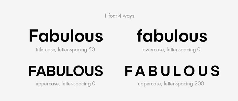
Type out your business name. Play with the case (uppercase, lowercase, first letter capitalized, etc.). If you aren’t using a script font, you can adjust the letter-spacing (the space between all of the letters). Correct the kerning (the space between each single pair of letters). Now stop. This is your logo.

“My logo could be better, but change is hard”
Rebranding doesn’t have to mean throwing everything out. The multiple fonts in your logo might not play well together, but maybe you can keep one. Your icon might be letting you down, but your colors could be just right.
Refining your logo – instead of starting from scratch – means that you don’t have to update all of your materials immediately. But in the meantime, you’re still making new investments in your business (redesigning your website, ordering business cards) with a logo that should be doing the most work for your business that it can. Changes don’t have to be big to be really effective!
Of course, the number one way to get a professional-looking logo is to hire a professional. They can make sure that your logo is modern but not trendy, works in any situation, is unique to your business, and above all, shows how seriously you take your business.
![]()
Elise Epp designs visual branding and websites for fashion startups, boutiques, and makers. She believes that the best branding is simple and expressive, where every detail counts. In her design process, Elise takes the time to create a visual brand that truly reflects the heart of your business, while always keeping your customer in mind.

Whitney
Hey there! GREAT article and advice. I have one version that works for pens and one that works for almost everything else. Should I err on the horizontal / pen version or keep both?
Elise Epp
Hi Whitney! It’s really common to have a few different versions of your logo – usually a main version and an alternate version. Often that is a horizontal version and a stacked version, but it can also be the wordmark (text) and an icon which can be displayed either together (lockup) or separately depending on the situation. I’d say if your two logos are derivations of each other, keeping both is fine. If your horizontal/pen version has a different font/icon, then pick one of your logos and stick with it.