
I’m about to write a new post and I’ve realized that over the past week, I haven’t even made a slight reference to Fashion Week. Why?! Not sure. So now it’s time to remedy this situation.
Now, it would take me hours to go through the never ending list of designers and mention my thoughts on the fabric color, texture, and silhouette. So I won’t. I will just touch on one that I liked and another that I found not so pleasing.
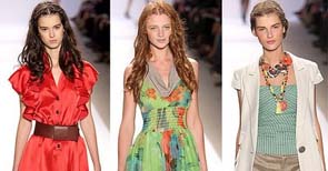
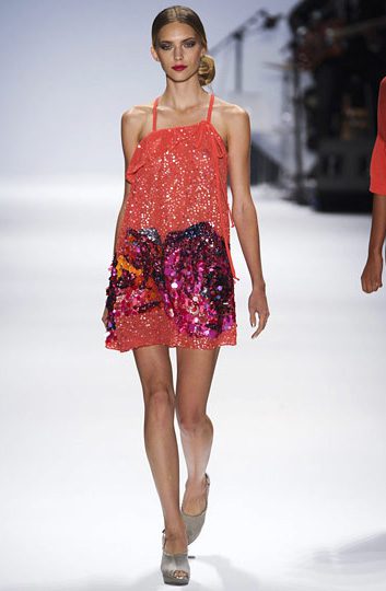
Nanette Lepore: I really liked her use of color which surprises me because there was a lot of coral/ purple/fuchsia goin’ on and I’m generally not a fan. But I liked it mixed with neutrals like gray, khaki, and white. I also really enjoyed the textures she put out there as well as the laser cutting and bit of sparkle.
Behnaz Sarapfour: I wasn’t really diggin’ this collection. I found the color to be flat and dull; navy, tan, gray, black, and white. I thought the fringe was kind of a half-hearted attempt at texture and the silhouettes seemed a bti frumpy. Lastly, the safari print was unappealing and I’m bored with lace already.
Anyway, that’s just my two cents which, in the grand scheme of things, really doesn’t mean much, right? That’s ok, I’m more interested in hearing your thoughts anyway.
